Monetizing A Limitation
sniffies is a map-based dating web app, used by millions worldwide.
role
Product Designer
timeline
6 mos
deliverables
User Flows
user research
user interface
user experience
Launch Ads
Problem
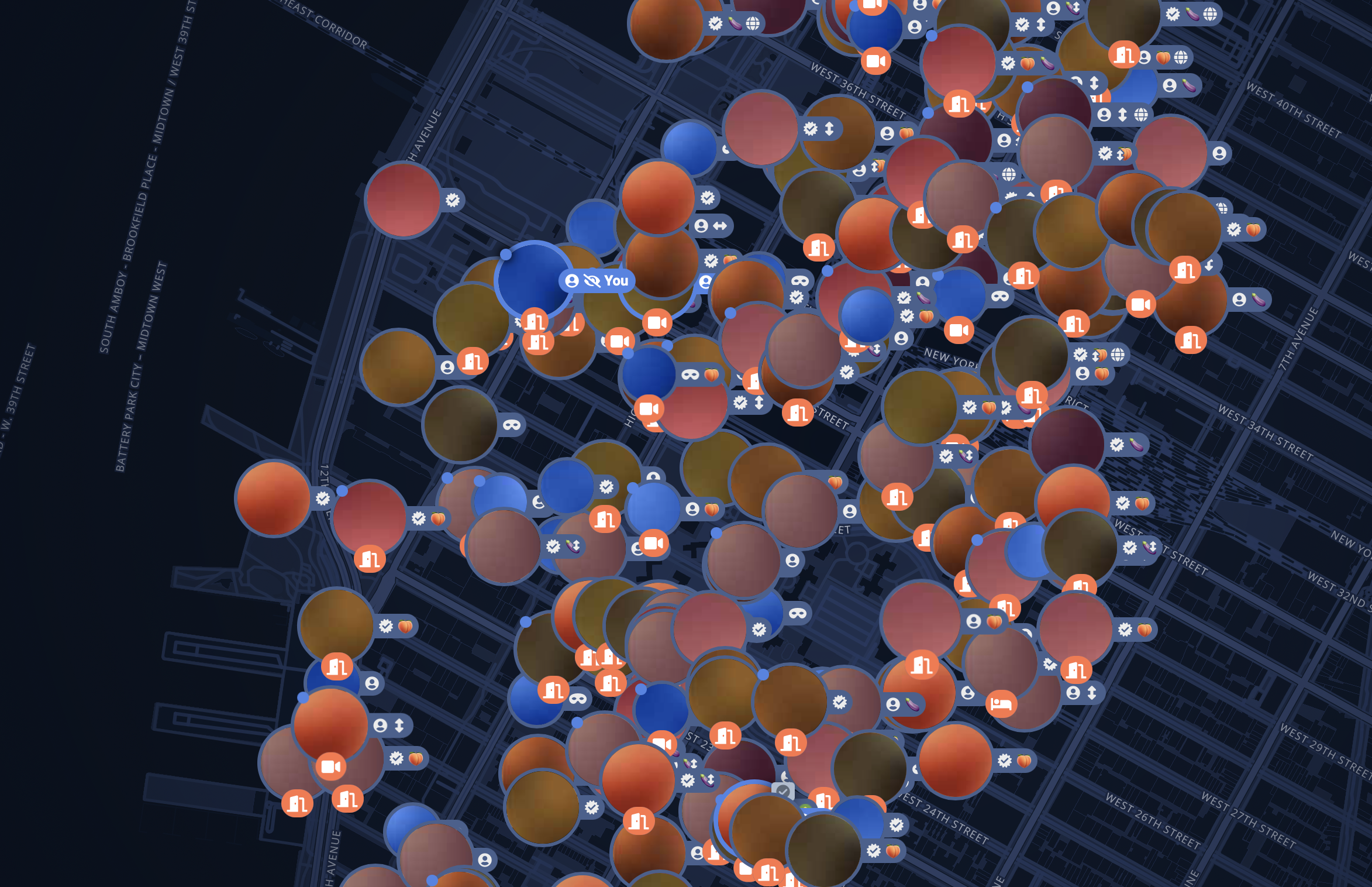
too many map markers slows the system down.
The web app’s interactive map automatically lazy loads markers (nearby users, locations, events) as you pan. Every pan loads new markers, which adds to the server load. Densely populated areas can have slower load times right where engagement is highest. this continuous panning and loading, although allows users to see as many map markers as possible, strains the server the more the user pans around, which causes the site to load slower than usual.
research
the limit does exist.
There has always been an invisible limit for most users: the map would just stop loading new markers. Based on customer feedback, most users accepted that the loaded markers were the only ones available to interact within any given area, at any given time.
Confusion
While testing the marker limit, in areas with fewer users, some users said fewer markers on the map made the app feel “empty”, devoid of options, which reflected poorly on the app’s usage health and image.
when do we limit
Do we keep continually loading new markers, up to the limit, Every time the user pans?
Do we only load new markers, up to the limit, after we allow the users to pan first, before clicking on a button to load new markers?
do we differentiate this experience for premium users?
solution
a new user browsing experience.
update the UX
What used to load more markers automatically, now causes too much server strain. User behavior dictates that users are always curious to see who is around the corner, who is just within the next neighborhood. This is when we introduced a new search function.
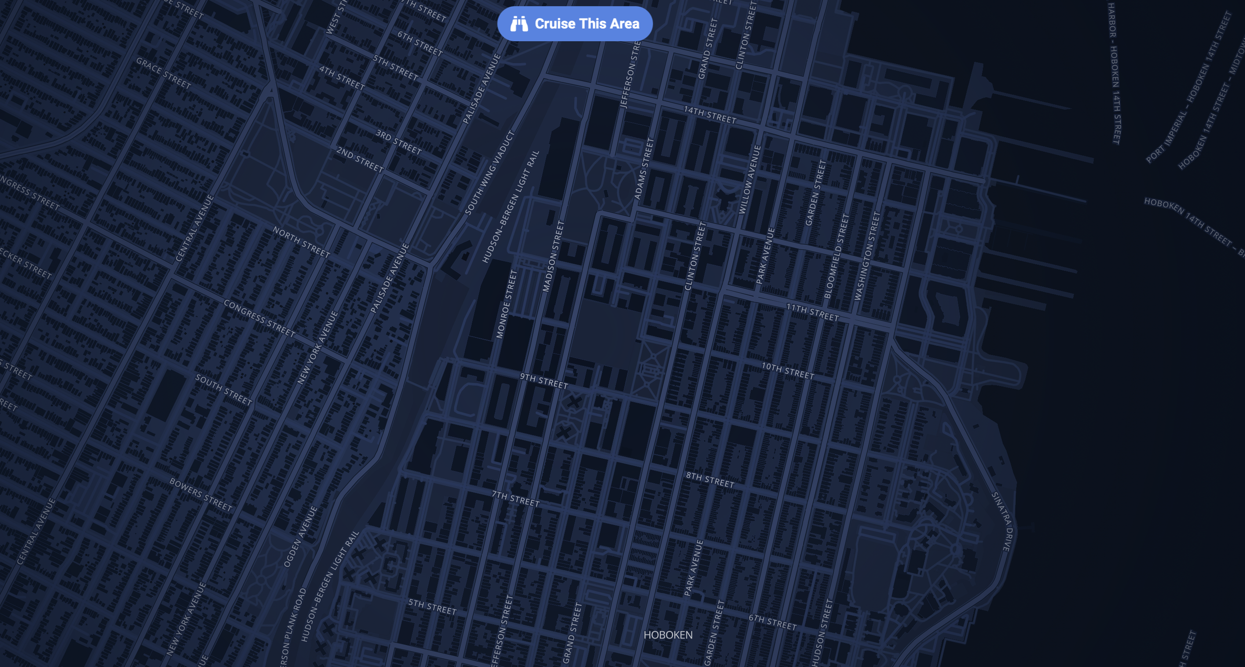
“Cruise this area” search function
new search function
Taking inspiration from other map-based apps, a new search function called “cruise this area” gives the user the option to load more users rather than automatically doing it for them. This significantly reduces the number of times our site has to call to load more users and assets from the server.
encourage signups
There’s a user type within the web app that is browse-only. It allows the user to take a peek without having to interact. to encourage more signups, we decided to require users to create an account before they can use it.
monetization
monetize the limitation.
In the dating world, more dating options is always better. For most non-premium users, the user options are limited to users only within your vicinity. In order to entice more users to upgrade, we only allow them to view other users who’s around them, by a set map radius, but they’d have to upgrade to premium in order to view their dating profile or message them.
Limit Radius determination
One of the app’s biggest draw is the quantity of live users at any given time. This quantity varies widely from sparse rural towns, to densely populated urban cities. It didn’t seem fair to give users in low population areas get the same radius as in dense ones. Through trial and error, we determined a tiered system where the map radius would update depending on the population density of an area on the map.
User Interface Enhancements
In order to differentiate clickable markers on the map for non-premium users, we added a simple circle to show which markers you can click on and which ones require you to upgrade.
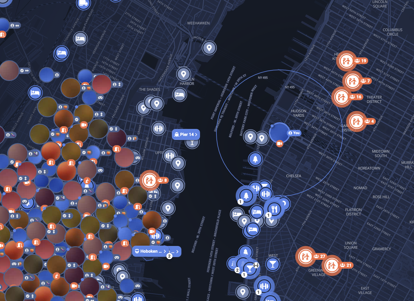
Sniffies map with radius
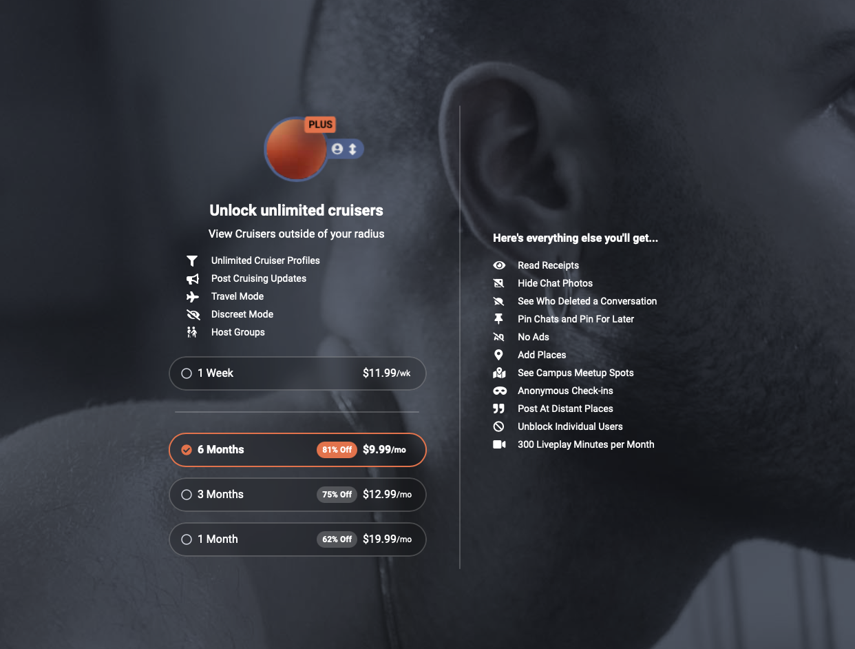
Sniffies upgrade page