improving the user carousel
Problem
information overload.
When browsing the web app, you are quickly inundated by the number of colors, icons, and images all over the map.
User Cards introduction
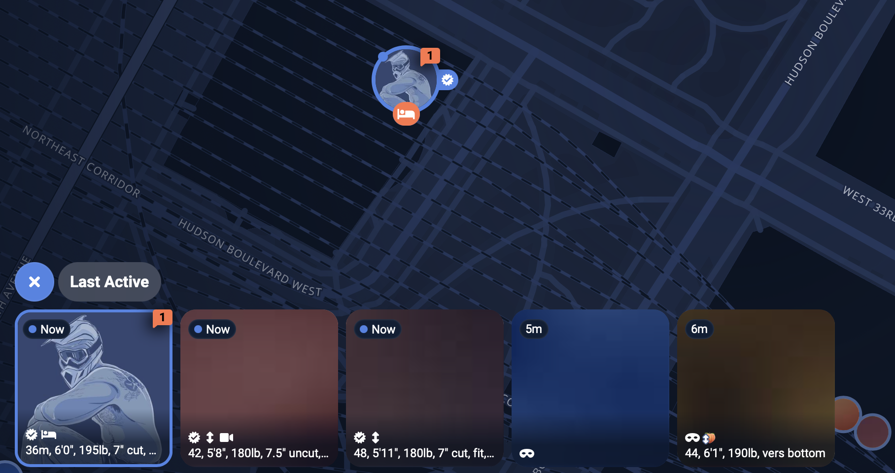
User cards are visible cards overlaid on top of the marker-filled map. They were introduced to give users a new browsing mode to see the users ordered by last active from left to right. Hovering over a card highlights that card’s location on the map. Clicking on a card brings up the full profile.
Introducing More Information
With the introduction of the user cards came more information on the map for users to have to look at to make their decisions. Based on user feedback, This made browsing a bit overwhelming.
Solution
information architecture.
During user testing, we’ve determined that key pieces of information were missing from the map markers versus viewing the cards.
Information Parity
We made sure the information users see on the map with the full version of the markers are also visible on the user cards.
Information Density
To reduce the number of information visible, I wanted to cut down on the information density that’s visible all at once. If a key piece of information is visible on the user cards, it makes sense to remove them from the map markers.
information size matters.
Once we determined which information was needed in each browsing mode, now we had to determine how to differentiate viewing the map versus prioritizing viewing the user cards.
Reduce and Reuse
Since viewing the map was already overwhelming by itself, if the user cards are active, I proposed reducing the number of information to just its purpose: where the user is on the map. The only feature we kept was the border color themes to indicate someone you’ve messaged before.
information-based browsing modes.
Viewing other users on the map has a different user interaction than viewing them using cards.
Map Browsing Mode
There were No changes to this browsing mode as the web app stood before the update. The users were allowed to pan, zoom, and tap on a marker to view their profile.
updated User Card Browsing Mode
The introduction of the user cards necessitated a new user card browsing mode. It now has its own experience separate browsing experience on the user card carousel from browsing solely by map and its markers. In order to prioritize the user cards, if and when the carousel is open, we resized the map markers so the cards stand out more. It reduced the information overload from the icons, indicators, and colors all over the map. Although this was a significant lift, it was an important discovery tool that needed to be explored.